Profuse Audiovisual
Project Overview
This project presented a comprehensive corporate rebranding challenge, requiring a complete overhaul of the company's communication and design.
The client, an audiovisual production company with two decades of experience in the Spanish market, particularly in videomapping, had recently experienced significant growth.
However, their corporate image lacked professionalism and did not align with their business reality. This incongruity was detrimental to their reputation and market positioning.
To address these issues, the company's management engaged our branding consultancy to implement a structured work plan, consisting of the following phases:
- — Phase 1. Strategic approach
- — Phase 2. Naming and Corporate Visual Identity
- — Phase 3. Art Direction
- — Phase 4. Website Design
Strategic approach
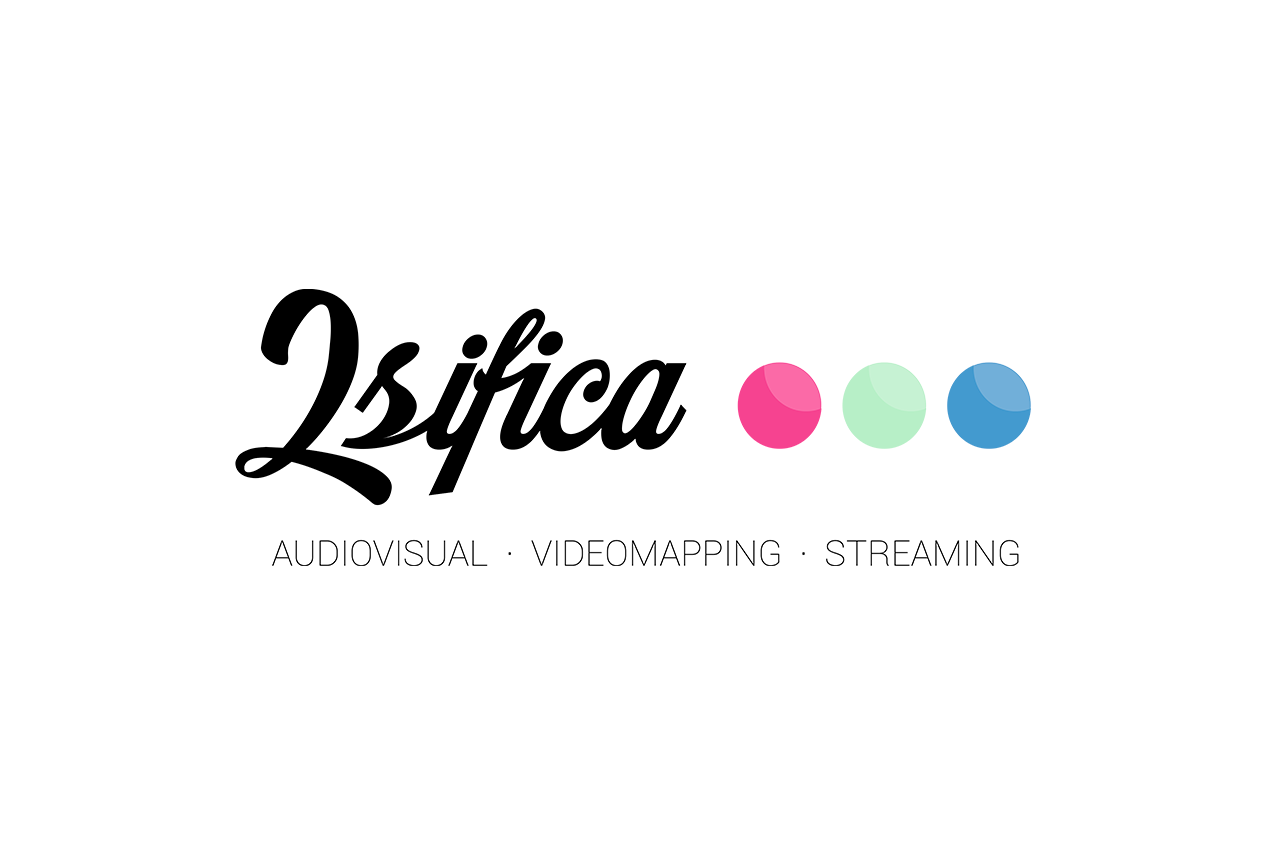
At the outset, the company was operating under the name "2sifica Eventos." It became evident that we needed to rebrand from scratch, starting with a new name and logo.
To achieve this, we conducted a thorough analysis of the company's business model and competitive landscape. We redefined the company's value proposition, ideal client, commercial offerings, and corporate culture.
With this information, we devised a branding strategy that would guide the communication and artistic direction of all our design efforts.

New name, new logo
The old name, "2sifica," was problematic, as it not only posed communication challenges but also conveyed a negative connotation of frugality and scarcity.
After extensive naming exploration, "Profuse Audiovisual" emerged as the winning choice. In stark contrast to the former name, "Profuse" conveys abundance, proactivity, and professionalism. The addition of "Audiovisual" emphasizes the company's core expertise.

Symbol
The geometric figure in the logo symbolizes precision, punctuality, and professional rigor. Its three-dimensional and modular design reflects the technicality of the company.
As specialists in videomapping, the lines on the volumetric contours align with the visual language of this field, creating optical illusions that can be viewed from multiple angles.
Typography
For written communication, the company adopted the Clan Pro font family. This sans serif font features simplified shapes, giving it a technical and dynamic appearance.
Corporate identity guidelines were established to ensure consistent and appropriate typography usage.
Versions
The Profuse identity is highly versatile and can be applied to various print materials and sizes. The logo has three configurations, including one horizontal and two vertical options, each available in both positive and negative versions.
This adaptability mirrors the confidence and trust clients place in the brand for technical event production.


Color
The original logo featured red, blue, and green, symbolizing the RGB color model in the audiovisual realm. While these three primary colors were retained, we slightly tweaked their chromatic values to craft a more distinctive and unique palette compared to competitors.
Adding yellow to this trio, we created a captivating color matrix that evokes the appearance of a pixelated screen. This matrix will serve as an intriguing visual element in Profuse's communications.
Advanced Version
We've also introduced a special logo version that seamlessly integrates the color matrix into the logo's geometry.
This version isn't designed to replace the original logo but is intended for independent use as a complementary visual element across various design applications.
Applications
We have furnished detailed guidelines for the correct application of the logo in various contexts, including corporate stationery, signage, labels, mailings, vehicle branding, and more.
Additionally, this manual includes the necessary files for the new logo and its applications, ensuring they are print-ready.


Art Direction
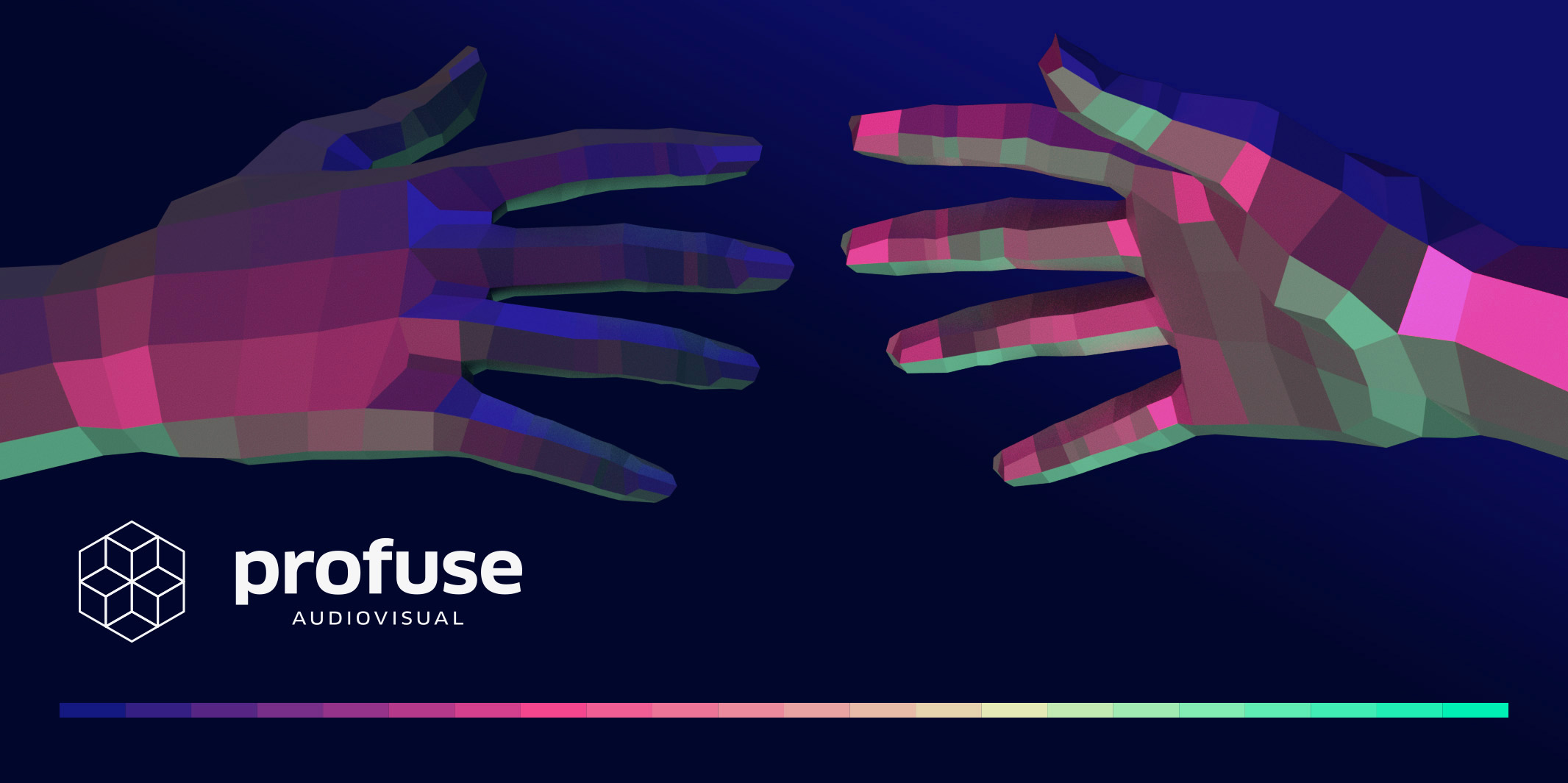
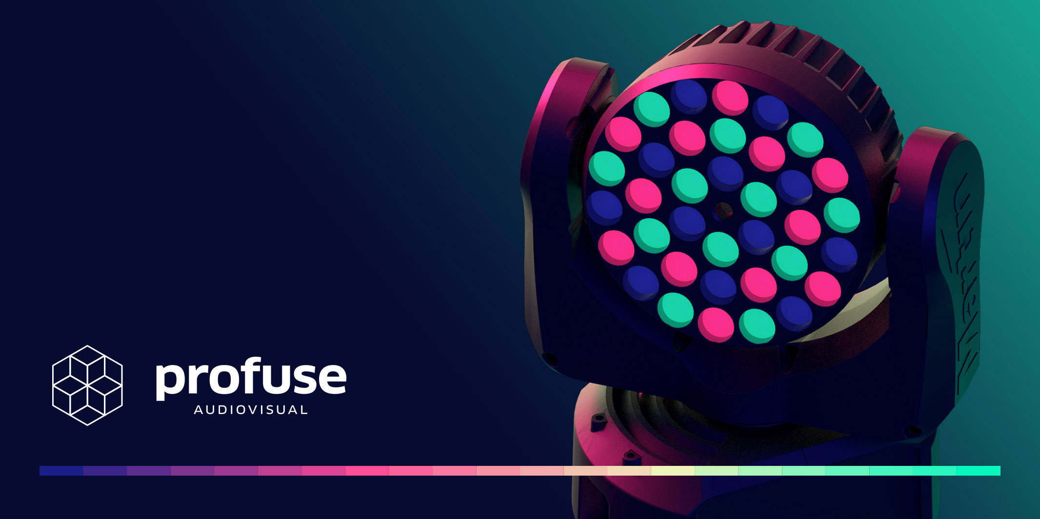
One of the central tenets of the branding strategy was differentiating the company through design. We created a distinctive visual universe around the brand, featuring 3D renders with carefully selected lighting, based on the core color palette.
This visual identity was seamlessly integrated into the website, effectively conveying the company's values of trust, technology, image, and spectacle.
Website
The website's primary target audience comprises advertising agencies and companies seeking a technological partner for their event production needs.
As such, it was crucial to craft informative content that was accurate and persuasive. The website was meticulously designed to ensure an optimal user experience, with a well-organized information architecture.
The visual elements of Profuse's branding were prominently featured, enhancing the user experience and creating a polished, functional website.
Visit the Website
- — UX / UI custom design
- — Marketing copy writing
- — 4 Devices
- — Video elements
- — Responsive design
- — High performance & speed
Results
The rebranding effort brought about a transformation in the company's business model. This shift attracted a new, more specialized clientele seeking higher quality services, and the company could now offer such services with a professional corporate image.
The website served as an effective communication platform, successfully connecting with the ideal client profile defined during the project. This resulted in an increased number of inquiries and more profitable projects within a year, all closely aligned with the company's specialization in audiovisual innovation.
According to Juanma García, the manager of Profuse, "We now have a heightened awareness of our image, a clearer business direction, and we are delighted with our new identity."


