Paris International Salsa Congress
Project Overview
The Paris International Salsa Congress, established in 2016, aspires to be a premier annual dance congress on a global scale. Since its inception, I have assumed the role of the creative director, closely partnering with the organising team.
My responsibilities extended beyond website development and included the comprehensive development of branding and design.
Welcome to Paris
In our inaugural edition, we faced the challenge of introducing our event to the worldwide dance community. Our mission was to create a high-quality product with a strong brand identity that encapsulated the event's core values: impeccable organisation, an international ambiance, and an unwavering passion for dance.
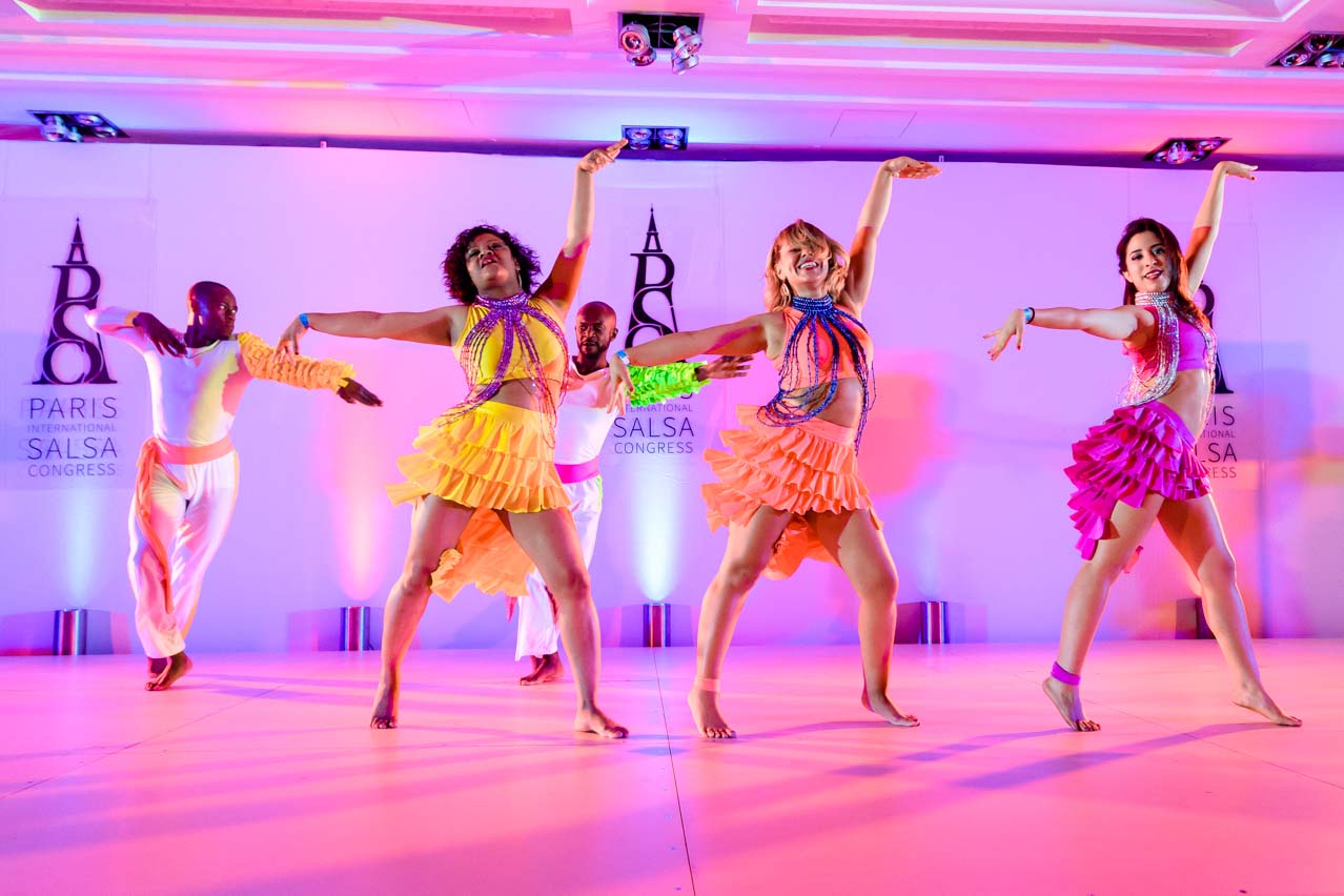
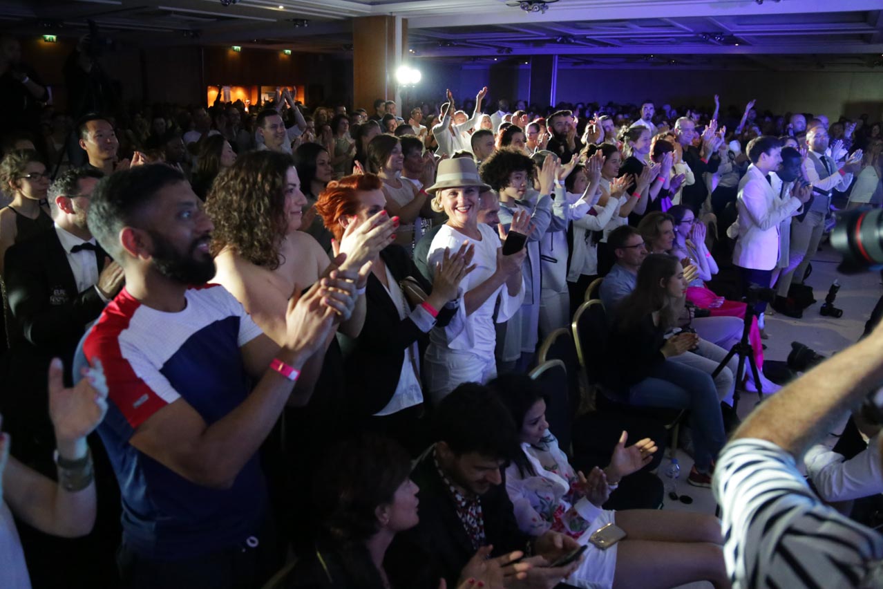
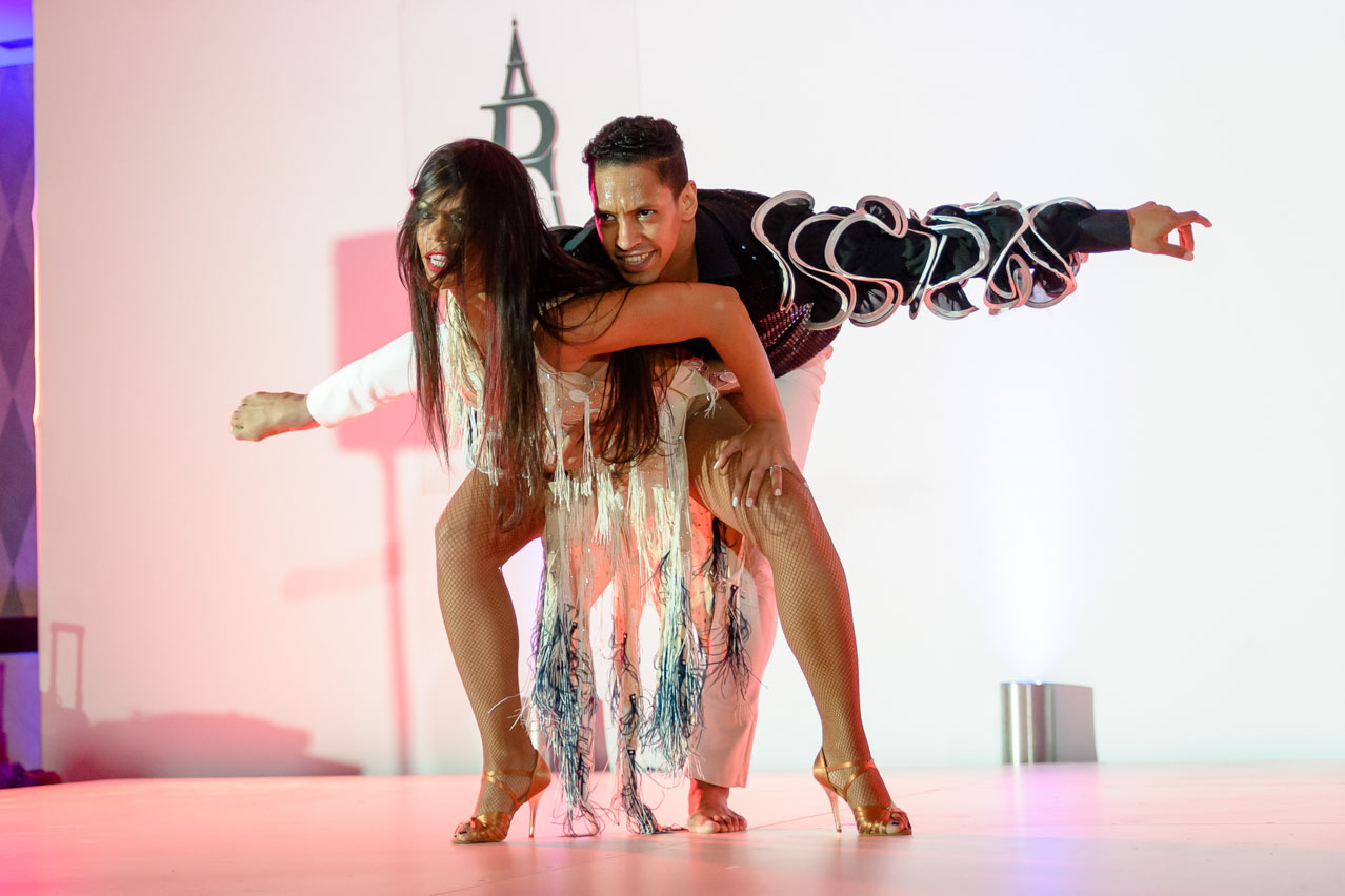
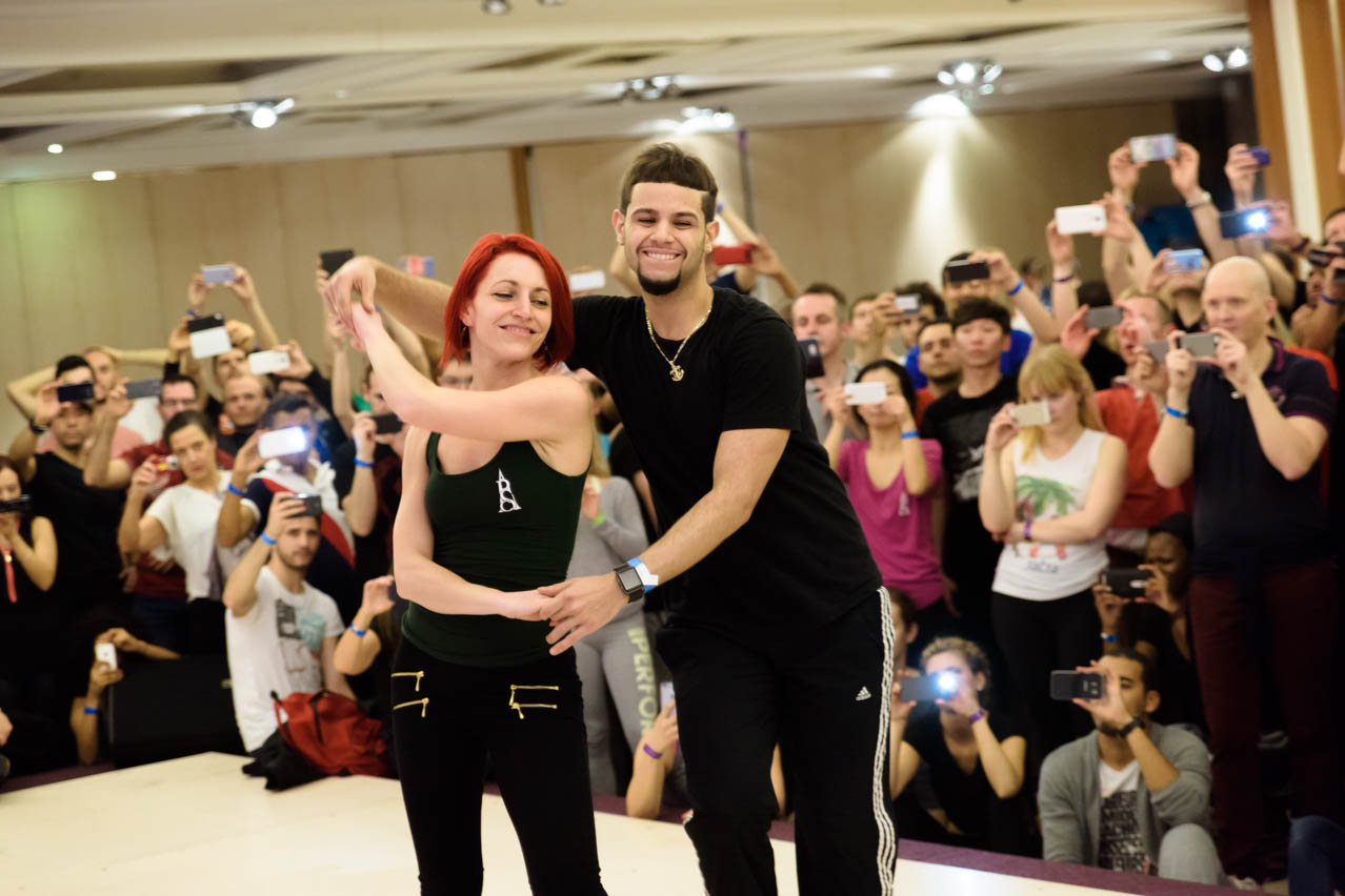
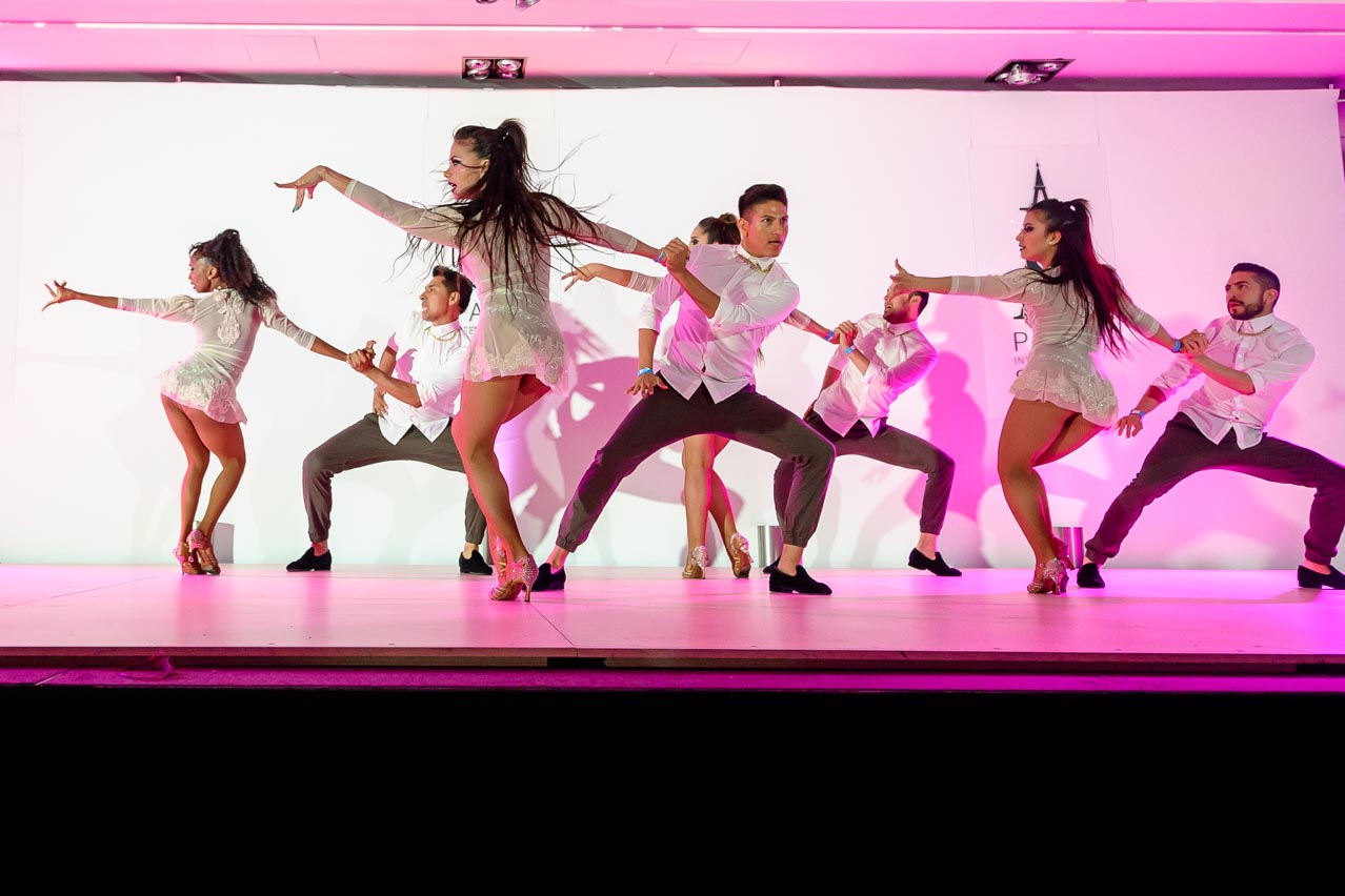
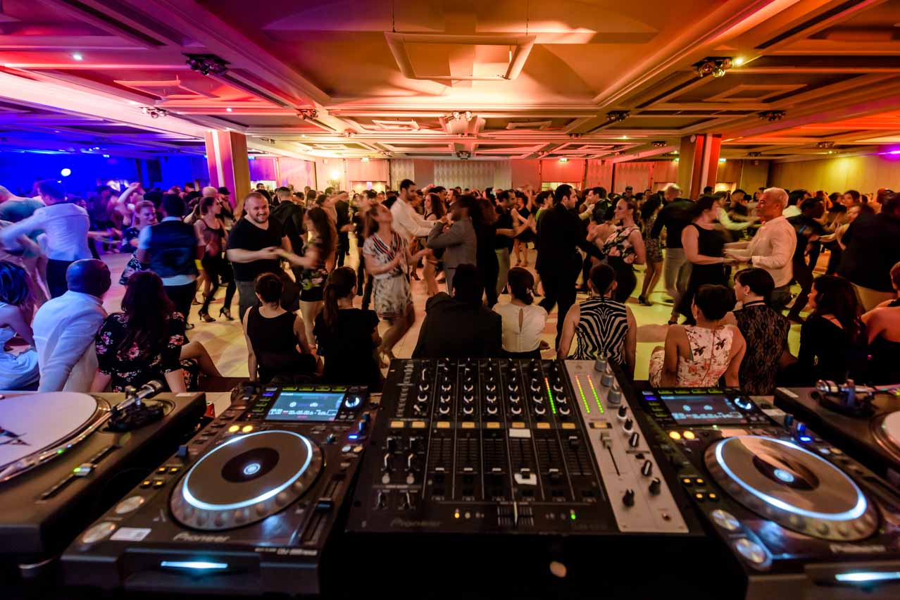
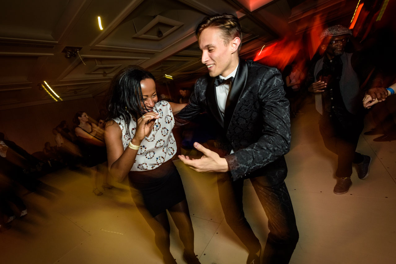
We decided to embrace the "Welcome to Paris" theme to extend our warm greetings to the 2,000 participants from over 50 countries. We encapsulated this essence with the slogan, "Dance in the City of Love."
Logo
Our project commenced with the design of a logo that ingeniously integrated the Eiffel Tower alongside the event's initials, "PISC." The inclusion of serif letters and graceful, sinuous shapes effectively conveyed the elegance and aesthetics associated with Paris.
This logo, characterized by its power and functionality, served as the foundational element for the extensive branding work that I diligently developed since 2016.
Color
After an extensive phase of market analysis and competitive research, we opted for a distinctive approach through a flat and minimalist design.
"Welcome to Paris" had to resonate with an international audience, extending a warm welcome to France. We chose the three colors of the French flag (blue, white, and red) as the primary color palette, complemented by a navy blue for high-contrast elements and three gradient combinations.
Typography
As we envisioned our audience traveling through airports and navigating an international landscape of hotels, we deliberately chose DIN as our primary typeface. DIN is globally renowned for its exceptional legibility and widespread use in signage, traffic, and regulatory documents.
Additionally, to maintain a seamless synergy with our branding and logo's serif style, we selected the elegant Adobe Garamond Pro as our secondary typeface.
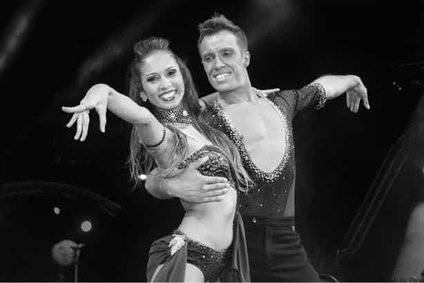
Photography
Given that it was the first edition, we had limited photographic materials at our disposal. The artists provided promotional images, which varied in quality. To unify the visuals, we chose to edit the images in black and white.
This approach seamlessly integrated with the rest of the design elements, establishing a coherent art direction with a striking color palette.


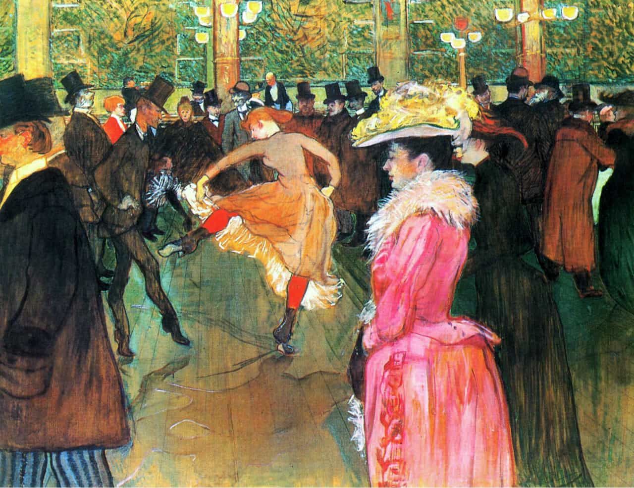
Ilustration
To finalize our art direction, we created a series of illustrations inspired by the renowned painter and poster artist, Toulouse-Lautrec, celebrated for his depictions of late 19th-century Parisian nightlife. These illustrations, simplified in form and color, added a playful tone while reinforcing traditional Parisian stereotypes, thereby establishing a unique identity.
With all these visual elements in place, we possessed a comprehensive toolkit to execute a distinctive, cohesive, and functional promotional campaign.


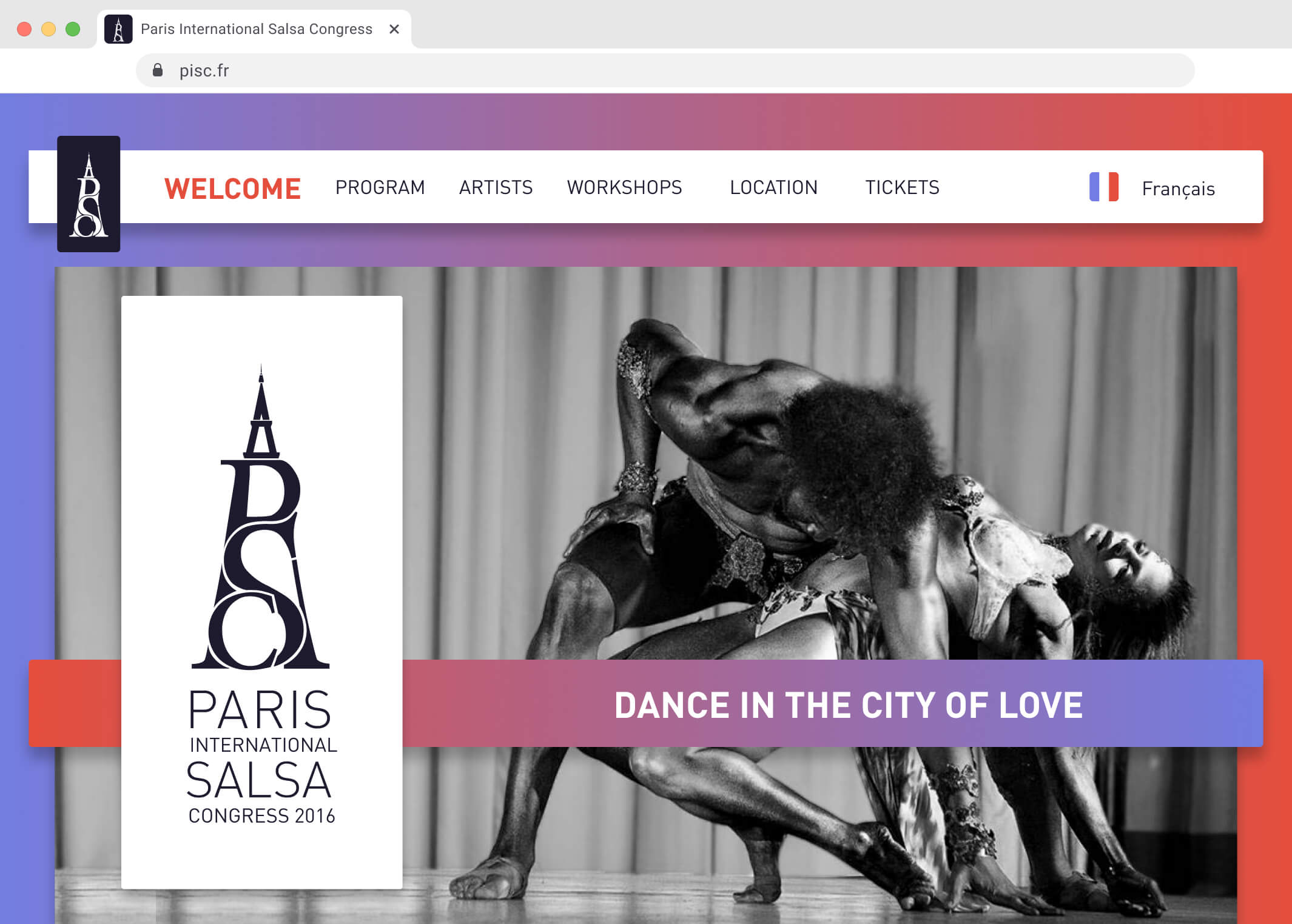
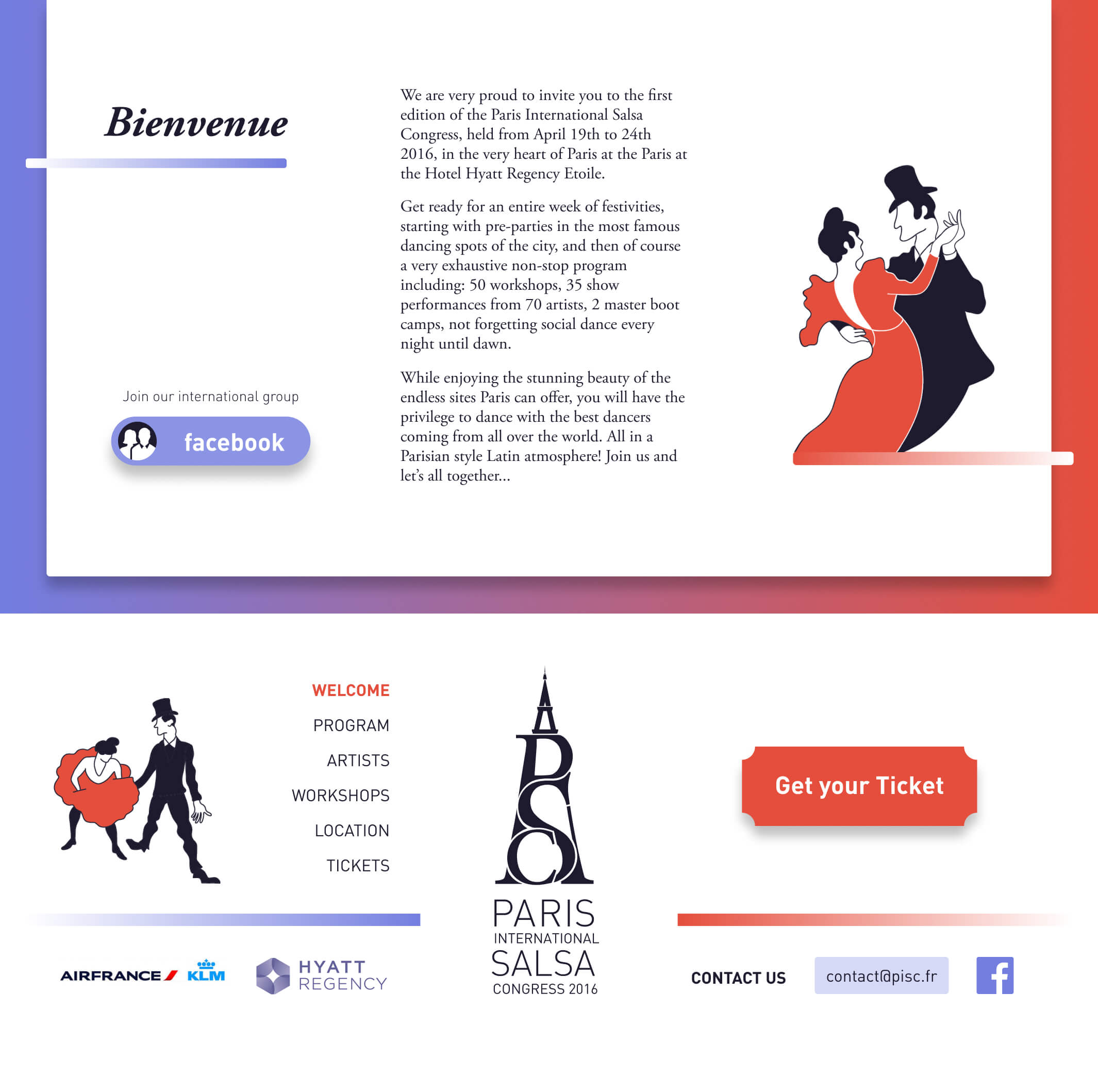
Website
I designed a user-friendly website with international users in mind, providing well-structured and easily accessible information, available on all devices and in two languages.
The design combined cleanliness and functionality with emotionally resonant images and vibrant colors that connected with users' passion for dance. The illustrations served to emphasize the event's Parisian identity, revealing its authenticity.
- — UX / UI custom design
- — Responsive design
- — 4 Devices
- — High performance & speed
- — 2 Languages
- — SEO Optimization
Designed with Figma
Figma served as our primary design tool, allowing us to create website layouts for four different devices: desktop, tablet, horizontal mobile, and vertical mobile. Then, I proceeded to develop the website using Webflow, a versatile platform for custom web design.
The final design resulted from collaborative teamwork, involving multiple individuals.
Results
The launch campaign perfectly fulfilled its objective of making the event known to our target audience.
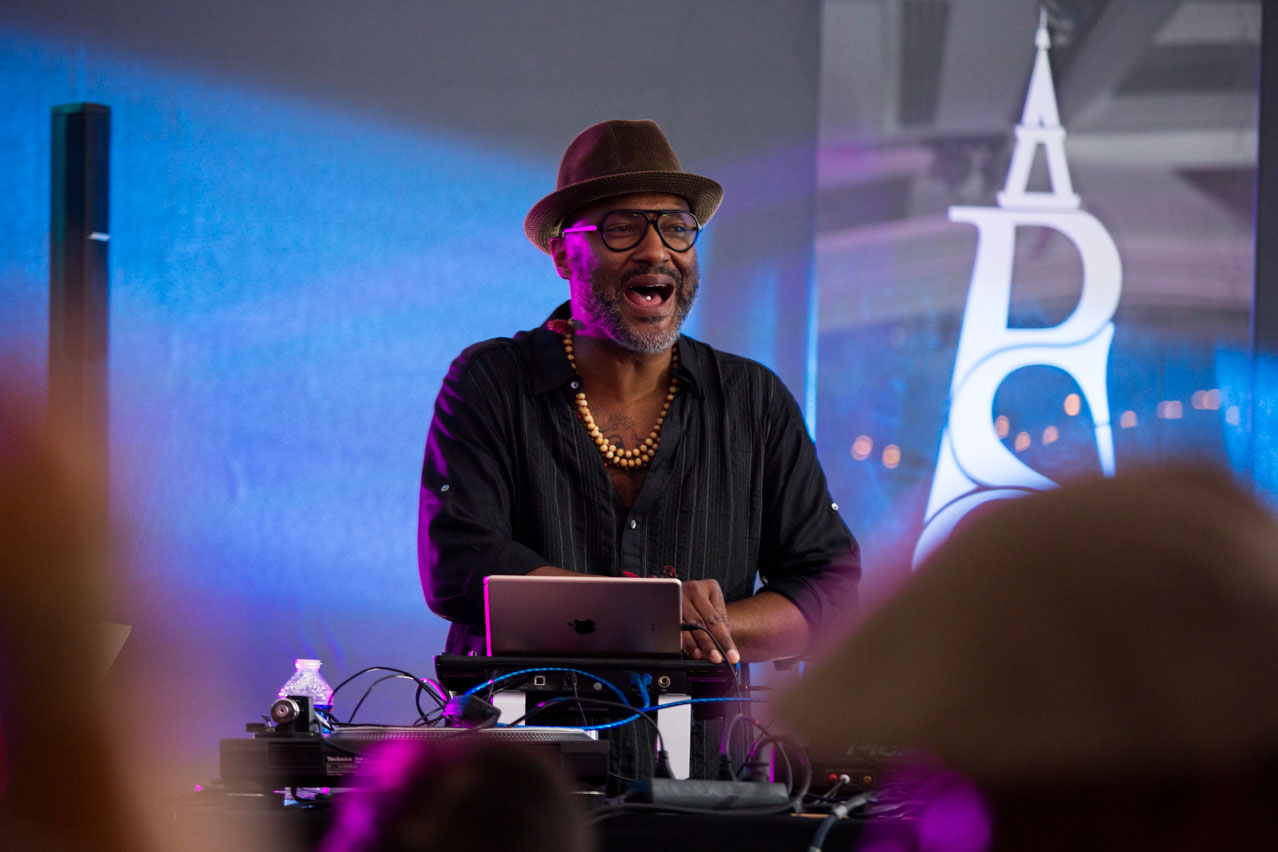
The program of activities exceeded the expectations of the attendees, raising their experience and enjoyment of all the activities thanks to the extraordinary work of the organization team.
The first indication of success was obtained with advance ticket sales, which were sold out two months before the event.
We registered a lot of positive feedback on social media. On the Facebook page we got a rating of 4.9 out of 5 stars.